Showing posts with label American Paint Company. Show all posts

Thursday, February 12, 2015

Born on the 4th of July

Pin It
Yes, I know it is February.  At the time my heart was looking for red, I craved a deep, rich blue.  Like this...
So pretty with a snowy backdrop.  This is APC's 'Born on the 4th of July'.  It is a lovely, lovely Indigo blue with great, deep pigmentation.  It dresses things up like a classic navy blazer, or dresses them down like your favorite pair of jeans.
The original brass hardware is gorgeous against this color.  It looks elegant and sophisticated even with some gentle distressing.  Underneath a bit of Desert Cactus peeks out.
Up close you can see the subtle color movement.  It reminds me of the depth of the seas and light plays so beautifully across it.

I have one like this already or it would probably stay and live with me for a time.  But, as with most of the pieces I work on it is for sale and will move along and grace someone else's home.  What do you think of this grand French lady?

Have a lovely Valentine's Day with the ones who hold your heart!
Deb

Friday, February 6, 2015

American Home Collection

Pin It
Good Morning!  We've been busy here at Twice Nice.  Busy, and digging out from some nice little snows here this week.  Ahh, winter.  Luckily APC's paints are no VOC, so even when the snow is flying and means no opening a window while I paint or wax, no problem.

One of our projects was a bit of this...
To make this...
Which you will find in this...
Which isn't as blurry in person.  Really, not sure what happened when I enlarged all of these. #needsaphotographyclassagain

Basically, we built a new display for the American Home Collection of paint colors for the booth.
The colors are lovely and vibrant.  The paint is a newer formula release that levels beautifully and has all the other lovely qualities you have to come to know and love.  
Here is a much better photo of the entire collection.  It is a limited edition collection that is available in cute little Pint size cans and also comes in sample sizes.  I hope you will give it a try.  They are such fun colors.  Brighten up your home with a fun new piece that makes a statement!

Have a great weekend!
Deb

Monday, January 19, 2015

A long, long time ago...


Pin It
I painted a desk and chair and then I got busy, and it got cold and snowy.  The poor desk and chair were never, ever photographed.  Sad story, huh?  Many times they even sell and there is not one photo to show that I toiled, fretted, and sweated over a piece of furniture.  I have forsaken before photos a lot, but I almost always try to take a picture of my 'babies' before they leave home.  Well, the sun came out for a brief bit, warmed the earth and I moved one of those pieces into my booth and it caught it's 15 minutes of fame.

Here is the sweet little Dixie desk and chair that I painted last Fall.  The color is Amber Waves of Grain, which is reading a bit brighter than it is in person.  It is a rich yellow, but not as neon as I am seeing it on my monitor.  Beautiful lines, plenty of storage and finished on all 4 sides so it could float in a space.  So pretty with it's original hardware.  I especially love it with the globe shaded lamp on it.  The lamp is painted in Surfboard, a gorgeous light aqua.

It is one of the pieces I moved into the new space (#43, Utah Ave.) at the Brass Armadillo.


Here's how it looked when I left.  I'm rather hoping there are a few things that have found new homes tonight.  Have a super week, go create!
Deb
Joining the party!

Elizabeth and Co.

Saturday, January 17, 2015

Re-do the Re-do

Pin It

Not every piece is going to be easy to transform.  Some days you are more inspired than others.  Some times the inspiration turns into a fabulous new creation, sometimes not.  I have those moments and most of you have had them too.  Here's my story of one of "those" days.

I have a nice Ethan Allen long, low dresser with a worn finish outside, but super clean and in good condition otherwise.  Simple right?  I thought so, and no I did not take a before photo because I just never seem to remember them these days.  My apologies. :-)

I chose a deep dark brown base of American Paint Company's Wild Horses.  Love that color for a base.  On top I painted a couple of coats of Smoke Signal on the body and Limoge on the drawers.  New hardware and voila`, finished right?
Not bad, but kind of blah, drab, and boring huh?  It just didn't inspire me.

I had tried a new (to me) technique to get a linen look to the drawer fronts.  It felt and looked cool in person, but the effect is totally lost when you look at it like this.  Then I messaged a fellow APC retailer, Shelly Andrade of Shizzle Design and whined about my blah piece.  Shelly was kind enough to quickly throw up some photos of dressers she had painted with plain flat front drawers.  They were fabulous, and inspiring!  If you have never followed Shelly you MUST check out her blog.  She and her sister Cathy do the most amazing things with their projects...Shizzle!

So back to work and here is what I came up with using Shelly's projects as my muse.

Now, there will be some of you, hello Mom, who probably won't like this any better than the first result.  Or maybe will like the first result even better.  But for me, it is heaven to see so much depth on those drawers now.  I have not mastered that technique by any means, but it was so fun to try it out.
Now you can see the linen patterns I had created on the base coats.  In addition to the Wild Horses, Smoke Signal, and Limoges I now have Freedom Road, Desert Cactus and more Limoges on the drawers.  I hit and missed painted I dry brushed, and sanded, I washed and I wet distressed.  I probably could have played for another week on these.
So which version do you prefer?  I wish I had some nicely styled photos for you, but the workshop is too full to set it up, the weather is too cruddy to take it outside, and my house is in full winter dark (with Christmas Decor still up, the shame of it all) to take a proper photo.  I will sit on this for a while and then decide if I want to change the body color a bit or maybe just layer on a different coat of paint.  You might get to see the Re-do of the Re-do of the Re-do.  It happens.

Have a super fab weekend!!
Deb

Monday, January 5, 2015

Painting Cabinets

Pin It
I've talked about painting my kitchen cabinets since before we even moved into our current home.  There is nothing wrong with them.  They are a quality, 19 year old, golden oak stained cabinet.  The rest of our trim and doors are also oak.  It's just a lot of oak for me personally.  I have looked at many different paints to complete this task over the years.  We've found some really good option, really good colors, just not a really good time.  It's a big job!  It will take time to clean, prep, and paint a full kitchen.  Then more time for things to cure.  Last winter I bought hardware...this winter I'm trying to remember where I stored it.  Uh-oh.

Up to this point I was shying away from using the no prime Clay/Chalk type of paints in my kitchen. Hello, chalk and clay are porous, and hello again, there are five of us of varying ages, skill levels, and general neatness that use this kitchen every day.  I was not going to do ally that work only to find someone managed to smear peanut butter on a door front while searching for a plate.  I may have changed my mind.

I retail American Paint Company paints and products.  This Fall they released a new product called Hard Coat.  Everyone who used it raved about the look, feel, and durability.  I decided to test it out on a spare kitchen cabinet I had picked up.  This was a small oak raised panel door.  It was raw wood so some slight difference from my own golden oak stained cabinets.  With all existing cabinets I would recommend a thorough cleaning with TSP or another degrease/degloss type of product.  Life happens all over our cabinets...just saying'.

I painted 2 coats of Home Plate, a creamy white, a coat of Hard Coat, taped off glazed 1/2 of my board with our brown glaze because I can't decide if that's what I want to do on my own cabinets, and finished with another coat of Hard Coat.  I did also do some light distressing to see if I liked that.  Then I sat it aside and ignored it for a month.  Paints and finishes need time to completely cure to their test their permanent durability.
See all those products on and around the door.  That's what I used to test the durability after the door had cured.  I used the wooden handle on the paint brush and scratched it around.  I used the paint key and scraped it all over.  I took the screwdriver and drew circles on my door.  Now, I could dent the wood, but no paint or finish came off that I could find.  Hopefully most of us would not use these types of tools on our own kitchen cabinets, but I wanted to see if paint would start to flake off.


Probably one of my biggest fears though is the dreaded food stain.  So I put a glop of mayo, salad dressing, olive oil, and spaghetti sauce on my door and left it for an hour or so.  Then I wiped it off with a damp cloth.  (You would not want to clean your painted or stained wood with Clorox wipes or other strong cleaners, just warm, soapy water is good!)

You know what, I was so pleased to find that none of those products created a stain, or appeared to penetrate through the Hard Coat at all!


I have decided that I'll start in the bathrooms and work my way up to the large kitchen project!  Hard Coat is an awesome product and I'll be using it a lot, especially on table tops.  I am so excited to be able to paint with our Natural, No VOC paints on these indoor projects!  And I'm super stoked about Hard Coat, which definitely lives up to it's name!

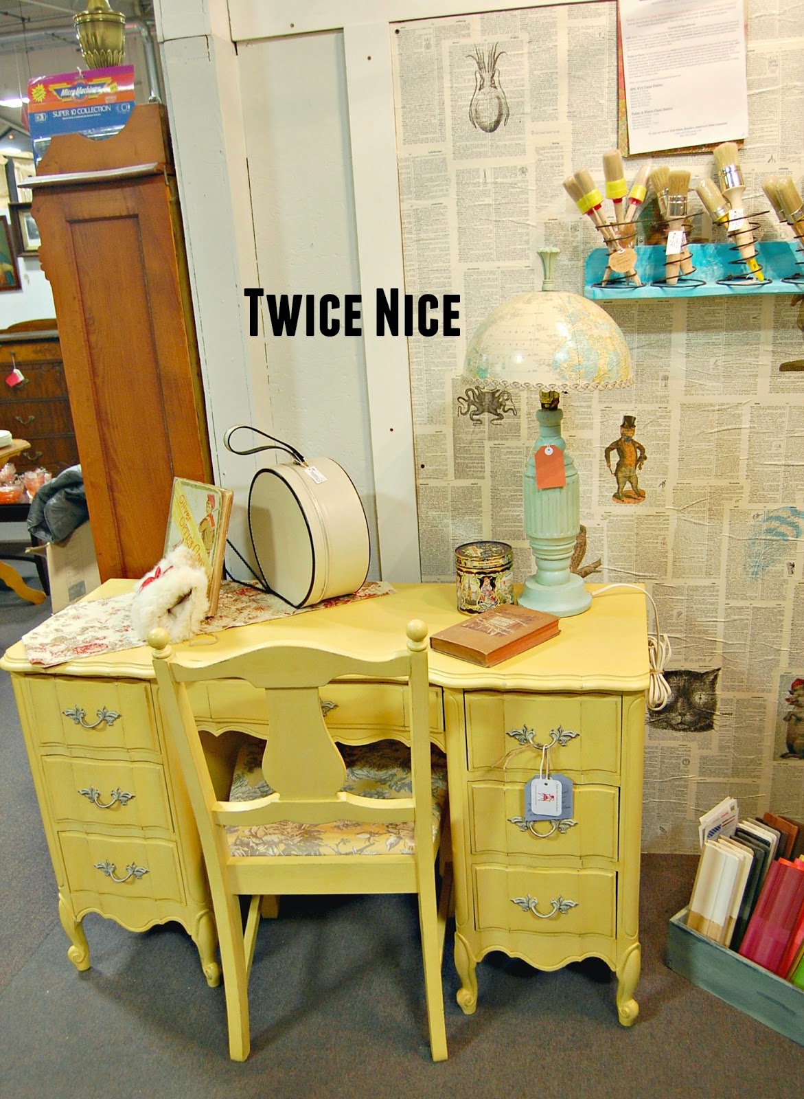
For the locals, I stock Hard Coat in the booth (#208) at the Brass Armadillo, and I have some at the workshop here at home.  Let me know if you have any questions!

It's that time of year when we look to freshen up our homes.  Let's get busy!

Deb

Tuesday, September 9, 2014

It's that time of year again...

Pin It  That time when I disappear for weeks at a time as I frantically try to finish some projects for our upcoming Prairie Market Sale!  It is a crazy, fun, mad dash to the finish line.  I never have much time for posting this time of year, but on the upside I will eventually get all these painted finishes out here for you to see.

Here's a quick little post and some eye candy for you to enjoy.

This ginormous chest of drawers was painted in American Paint Colors, Born on the 4th of July, Peacock and Desert Cactus, blended to give it some movement.  The stencil and pulls are straight Born no the 4th of July.
I can not say enough good things about the rich pigmentation of APC's paints.  They are so rich and have so much depth.  I sealed with clear wax, but I think it would have been cool to have added another color mixed in the clear wax to add another layer.  Soon I will have to try that!
Very light distressing this time.

Some pieces are just so easy to do and easy to love.  This was one of those lucky ones that matched exactly what I saw in my mind before I began.
Wishing you that kind of luck this week with your projects!
Deb

Tuesday, September 2, 2014

America

Pin It
America, America, God shed his grace on thee...

How fun it was to work on a dresser for a wonderful lady named Willie.  Willie wanted a dresser done for her grandson who shares her love of Country.  She said "Americana" themed and turned me loose.  

In order to keep it more masculine I decided to use the same process as the Subway Art Dressers and substitute  patriotic words and graphics.  What do you think?  Did it work?
I used American Paint Company's 'Fireworks Red' over 'Born on the 4th of July'.  I used my Silhouette to create the stencils and lots of different fonts to add some interest.
The dresser was a fun one and came together quite nicely.  The top was sanded and re-stained, the knobs were cleaned up and polished with dark wax.  The body of the dresser was finished with clear wax and buffed to a nice sheen.  Love my buffing brush!!!
And Crown thy good with Brotherhood, from sea to shining sea.

Have a great week!
Deb

Friday, August 22, 2014

A little Boho

Pin It
Getting things photographed when you are working at warp speed presents a challenge, but I am super excited to show you this next piece.  I've been loving me some stencils lately.  I've also been having some fun mixing paints to make some new colors.
Meet the Bohemian Side Table which isn't quite this orange in person.  I think I amped up the saturation a bit in Pic Monkey.  Anyhoo, this is a sweet Thomasville side table that was worn out and needed some oomph!
I mixed some of American Paint Co.'s Orange Grove with A-Maize-Ing and a little bit of Shining Seas and a drop or two of Fireworks Red and ended up with a color I call Marigold.  It is bright and cheery without being neon.
My stencil color is a pretty Pumpkin mix another APC retailer came up with by mixing Orange Grove with a bit of Saddle.  Brilliant!  I had been wanting to mix a Pumpkin color and I love what she came up with.
Don't you think the stencil and color gives this piece a definite Bohemian vibe!  I love it and wish I could talk one of my kids into a Boho Inspired room!  Maybe one of you will need this for yours?

Have a great weekend!
Deb

Linking to:


Furniture Feature Fridays

Tuesday, August 19, 2014

Life, Liberty and the Pursuit of Happiness

Pin It
Well, I must say coming up with titles in the middle of the night is not my superpower.

You know the Prairie Market Gals sale is coming up soon right?  I don't exactly get into a panic, but about this time every year I start looking around and thinking I better kick it into high gear if I'm going to get through the pile of 'want to do for the sale' pieces.  So, you'll either see a bunch of reveals flying at you, or radio silence.  Since I like reveals, that's what I'm going to try to do.

Here's a recent finish for you and she's a Grande Dame!  We found a beautiful heavy oak buffet recently with a tag that had an added "last chance" sticker.  Seriously, would they toss something this gorgeous in the landfill if it didn't sell fast enough?!  It makes me sad.  But fear not, she has a chance to be useful again!
Meet Liberty.  Catchy right since that is the color name for the paint I used?  I used American Paint Company paint in Liberty on this piece after my mother suggested a sagey green when I said something about painting her black.  I am ever an obedient child.

Liberty has oodles of personality and details.  Look at this drawer!  The hardware is the same as "the sorority dressers" and they were stamped by the manufacturer 1940's so I'm going to assume this one came from that same time period.  It has a Creston, IA stamp on the back.
This photo really caught the color well.  What do you think of the the color?  It is really in nice shape for a piece that was sitting on death row.
Oops, look what I found lurking in the flowers during the photo shoot.  It's a cute Lion!  She would correct me and say it's a FIERCE lion lurking in the flowers.  Rally Sunday at church, good times!
At any rate, I am happy to say that Liberty has many more years ahead of her.  She'll be at the Prairie Market sale.  October 3 & 4, see the button at the top of the page for more information.  Come say Hi in person!!

It's going to be a fabulous week!
Deb

Linked to:

Elizabeth and Co.

Monday, August 11, 2014

Custom Colors/Custom Work

Pin It
Happy Monday all!  I have had a busy weekend and first couple of weeks of August.  Thanks for all the prayers you sent for our Ellie.  She is doing well with her recovery and we thank God for that!

I was able to complete the sweetest little drop leaf table and 2 old oak chairs last week.  Thanks to the Mr. we were able to re-glue the top and rebuild the frame for the table.  It was such a clever design.  That's what I love about Vintage pieces that you just don't see with the mass manufactured.  The table top was stained and the base and chairs were painted in Home Plate.  You are probably noticing that I am just rambling on describing this to you instead of flashing lovely photos up.  That is because it went straight from the workshop into the van for delivery instead of out for a quick photo shoot first.  Imagine that, I do seem to do that with custom work more often than not!  Maybe Kelly will see this and shoot me a photo to insert in here at some point.  Trust me it looked fabulous in her new kitchen!

Never fear though, I will show you one more that I was able to finish last week and since I still own it there are photos!

This is my all time favorite style of dresser.  You might notice that it lost it's doors somewhere along the way.  No worries, I actually like it better without them!  This is a custom color, Liberty mixed with Surfboard.  I saw this on another American Paint Company retailers dresser and wanted to try it myself.

It makes for a lovely blue green or green blue depending on your paint to paint ratio's.  And I have to say that APC's paints blend so well together and make it easy to expand your color options by combining paints!
With the absence of the doors I went ahead and painted the inside and outside of these drawers although they were in great shape.  That's pure Surfboard inside, though this photo is pretty color saturated and it's not quite that bright in real life in my opinion.

Look at the lovely hardware that this one came with!  I cleaned it up and slapped it right back on.  Too pretty not to use again.
This was a fun piece to work on. And since this photo shoot I got the very simple, pretty backboard put on and it will be ready to go for our Prairie Market Sale on October 3 & 4!  Hope to see you there!

Be good to each other this week!
Deb